PreTreat
Logo redesign for a brand relaunch.
PreTreat is a metal treatment company based in Todmorden, West Yorkshire. After more than twenty years in business, we worked with them to modernise their logo, ensuring it reflected both their expertise and future direction. The identity was developed as a flexible system, with a bold 3D logo for digital use and a simplified 2D mark for uniforms, labels and print. The result is a clearer, more confident visual identity that balances innovation with the brand’s industrial roots.


Baby Blue
Bright Red
Deep Red
Grey
Logo design
before and after
The recognisable shape of the original logo was retained and refined, allowing the brand to feel familiar while presenting a more modern, confident identity.


Before
After
Case Studies
first impressions that count.


02
Website for a Huddersfield-based therapy business, alongside a full branding and marketing project.

03
Logo and branding project for a Leeds property company, followed by additional printed assets.

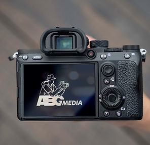
Videographer
05
Hand-drawn illustrated logo for ABG Media, an Australia-based videographer company.