Shapland Property
Logo, branding, welcome booklet, keyrings, and business cards as part of a new brand project.
Shapland Property Group is a new rent-to-let business, established in January 2023. The founder, Conor, was looking for a visual identity for the company and collaborated with Derf to create their SP logo. Shapland Property now works with Derf regularly to design welcome booklets for their guests and has since created business cards for all their corporate needs.


Conor knew he wanted his logo to include the letters 'S' and 'P' and use a serif font. The final logo incorporates a subtle house roof within the 'P,' uniting both letters in harmony.


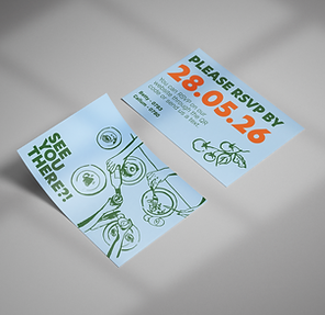
A welcome booklet was designed to set Shapland Property apart, ensuring guests are warmly welcomed into their properties. We collaborated with Conor to identify what he wanted to highlight in the booklet and created an A4 version that perfectly aligned with his new branding.
Navy
Camel
Champagne
The navy, champagne, and camel shades were selected to give the business a sophisticated, elevated, and luxurious feel.
More recently, we suggested personalised keyrings for Airbnb clients to enhance the feeling of luxury. Business cards have also been designed for Conor, helping him to attract new clients.
Case Studies
first impressions that count.


02
Website for a Huddersfield-based therapy business, alongside a full branding and marketing project.

03
Logo and branding project for a Leeds property company, followed by additional printed assets.

Videographer
05
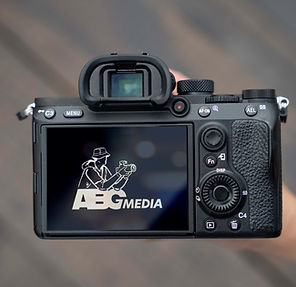
Hand-drawn illustrated logo for ABG Media, an Australia-based videographer company.