Therapy Huddersfield
Logo, website redesign and marketing.
Therapy Huddersfield is an established therapy practice founded in 2013. We worked with the founder, Nat, on a full brand relaunch, including a new visual identity, website and ongoing marketing.


The logo symbolises two people in connection, reflecting the core principles of therapy. The forms subtly create a lowercase ‘t’ and ‘h’, embedding the brand name within the symbol itself.


Squarespace website designed for Therapy Huddersfield along with logo and rebrand.


We worked on a full website redesign using the new logo and branding created by Derf Design Studio.
The site combines harsh lines and softer curves to convey authority with a personable approach. We collaborated with Nat to identify key messages and calls to action for clients. Stage one focused on discussion and understanding the website’s purpose, messaging, and overall tone. The second stage centred around user journeys, design, and content, followed by several rounds of proofing and user experience analysis.
Navy
Clinic Blue
Dusty Blue
We focused on selecting a blue that conveys a clinical and professional feel while still feeling friendly and welcoming. The navy is used as a stark contrast colour to emphasise the luxury element of private therapy, while the dusty blue offers a subtle, relaxing tone that complements the pure white.
Case Studies
first impressions that count.


02
Website for a Huddersfield-based therapy business, alongside a full branding and marketing project.

03
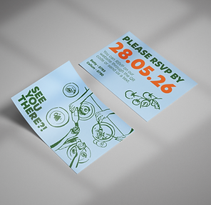
Logo and branding project for a Leeds property company, followed by additional printed assets.

Videographer
05
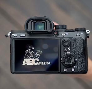
Hand-drawn illustrated logo for ABG Media, an Australia-based videographer company.